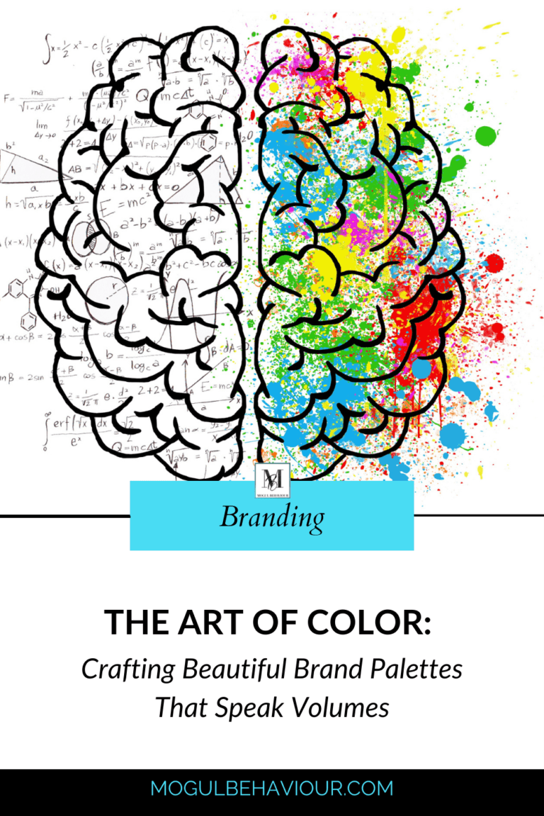
In the vibrant world of branding, colors wield an incredible power to communicate messages, evoke emotions, and leave lasting impressions. From the fiery passion of red to the calming embrace of blue, each hue holds its own significance and can profoundly impact how audiences perceive a brand. Today, we embark on a journey into the art of creating stunning brand color combinations and uncover the meanings behind some of the most iconic shades.
The Power of Color Psychology
Before diving into the intricacies of color combinations, it’s essential to understand the psychology behind each hue. Colors have the remarkable ability to evoke specific emotions and associations, making them a crucial element of brand identity.
R E D
Bold, energetic, and attention-grabbing, red commands the spotlight and ignites a sense of urgency. It symbolizes passion, excitement, and vitality, making it an ideal choice for brands seeking to evoke strong emotions and stimulate appetite—just like the iconic red and yellow hues of McDonald’s, which tantalize taste buds and beckon hungry patrons.
B LU E
Serene, trustworthy, and dependable, blue exudes a sense of calm and professionalism. It represents stability, reliability, and authority, making it a popular choice for corporate brands and financial institutions. Think of the soothing blue tones of IBM or the reassuring presence of Facebook’s iconic blue logo.
Y E L L O W
Bright, cheerful, and optimistic, yellow radiates warmth and positivity. It evokes feelings of happiness, energy, and optimism, making it an excellent choice for brands that want to convey a sunny disposition and stand out from the crowd. Just like the golden arches of McDonald’s, yellow captures attention and sparks joy.
Crafting Harmonious Color Combinations
Creating a harmonious brand color palette requires careful consideration of color theory, aesthetics, and brand identity. Here are some tips to help you craft beautiful and impactful color combinations:
1. Start with brand values: Identify the core values and personality traits of your brand. Are you bold and adventurous, or calm and sophisticated? Choose colors that reflect your brand’s essence and resonate with your target audience.
2. Consider contrast and balance: Aim for a balanced mix of colors that complement each other while providing visual interest and contrast. Experiment with different color combinations to find the perfect balance between harmony and contrast.
3. Understand color harmony: Familiarize yourself with color harmonies such as complementary, analogous, and triadic schemes. These harmonies can guide you in selecting colors that work well together and create a cohesive brand identity.
4. Test and iterate: Don’t be afraid to experiment with different color combinations and solicit feedback from your audience. Conduct A/B testing to see which color palettes resonate best with your target demographic and adjust accordingly.
Unlock Your Brand’s Potential with Mogul Behaviour
At Mogul Behaviour, we specialize in helping brands unlock their full potential through strategic branding and design solutions. Our team of experts understands the power of color psychology and can help you create a stunning brand identity that captivates audiences and drives results.
Ready to take your brand to new heights? Contact us today for a comprehensive brand audit and discover how we can elevate your brand through beautiful color combinations and strategic branding strategies.
Don’t let your brand blend into the background—stand out with Mogul Behaviour.
Contact us to schedule your brand audit today!
The art of crafting beautiful brand color combinations is a delicate balance of creativity, psychology, and strategic thinking. By understanding the meanings behind certain colors and harnessing their power, brands can create visually stunning identities that resonate with audiences on a deep and emotional level. With the expertise of the Mogul Behaviour team, your brand can shine brighter than ever before.

